remote sensing

Google Earth Engine vs. the Microsoft Planetary Computer

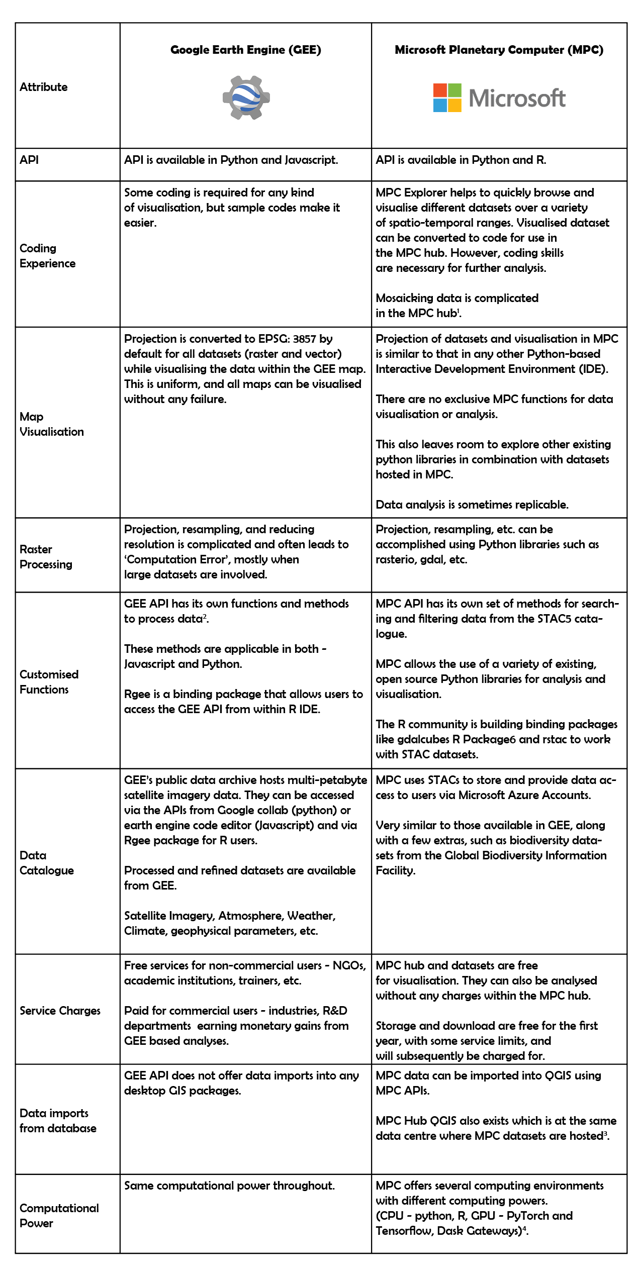
I have been using Google Earth Engine (GEE) for two years now. It was initially difficult to understand the interface, language, analysis and visualisation, but this became simpler over time. Time-series analyses, plots and animated gifs/videos are easy to implement in GEE. Recently, I also began exploring Microsoft Planetary Computer (MPC) for satellite imagery processing. During this process, I made some initial comparisons between GEE and MPC, which I’ve detailed below.

  1. I viewed a spatially mosaicked dataset in MPC. However, one can download only individual images and not the mosaic of the area of interest. The ready-to-use codes for individual images are generated at MPC Explorer which can be used to view the image in MPC Hub. I also tried mosaicking the Sentinel dataset manually in MPC hub using this tutorial which uses GDAL’s ‘build VRT’ function. The tutorial used the National Agriculture Imagery Program (NAIP) dataset. However, the GDAL ‘build vrt’ code failed to work on the Sentinel dataset, as Sentinel and NAIP datasets are stored in different hierarchical formats.

  2. Customised functions make basic raster and vector processing easy, thereby enhancing user experience.

  3. The MPC datasets can be visualised and analysed using QGIS tools within MPC without the need to download them.

  4. Users can create Dask Gateways or switch to different computing environments based on their task to scale the computation and fasten the process. This needs coding experience, and it is not automated. Users decide which is the best environment for their task.

  5. STAC - Spatio-temporal Asset catalogue - a commonplace for users to look for spatial data. This was created to have a common code for accessing all spatial datasets. 

  6. “gdalcubes” is a library to represent collections of Earth Observation (EO) data. Data cubes may be simply exported as NetCDF files or directly streamed into external software such as R or Python. gdalcubes is not a database instead simply links to existing files / GDAL datasets - Source

I believe that when trying to compute large datasets, MPC has an advantage over GEE, as it provides access to different environments with a range of available computational power. The familiarity of using known Python and R libraries for analyses can be comforting for experienced users. On the other hand, I realised that all datasets in MPC are not homogeneously stored, and thus the code to extract & manipulate data may not be applicable to all datasets uniformly. While MPC is very useful for specific use cases, it will become even more useful when the planned introduction  of customised raster and vector data manipulation functions is completed. 

With regards to GEE, existing tutorials, extensive documentation and more customizability make tasks such as visualisation, storage, conversion between spatial data formats, raster and vector functions (such as mosaic and clip), easier for me than in the newer MPC. The most important utility is the flexibility to download analyses in GEE as this makes the data publishable and replicable. Bulky tasks like supervised classification are also less time consuming in GEE than in desktop GIS because of customised functions. While GEE requires minimal coding experience, most MPC tasks seem to be available only to skilled professionals at this point.

In conclusion, I’d like to caveat this article with the fact that at the time of writing, I have more experience using GEE than MPC, and I’m sure I haven’t explored the full capabilities of both platforms. Suggestions or comments are welcome; please get in touch via our contact form.

Conservation Cartography with Mongabay-India (Part V)

We began our collaboration with Mongabay-India to enhance their stories with our spatial analysis expertise. Our shared objective to diversify environmental awareness to communicate to a larger audience continues as we embark on our second year of collaboration.

From October 2021 to June 2022, we’ve worked together to produce 30 maps and map-related/cartographic media for 23 stories in 11 different verticals by Mongabay-India. This blog documents the final set of articles we visualised together from October 2021 to June 2022.

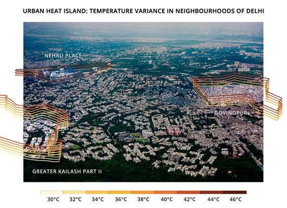
[Illustrations] Why are temperatures within a city’s neighbourhoods different?

The minimum and maximum surface temperatures of three Delhi neighbourhoods with varying socio-economic and physical characteristics were taken around noon on May 3, 2021. The range of temperatures in a given neighbourhood is stacked in intervals of two degrees Celsius and represented in the illustration. Illustration by Alisha Vasudev/Mongabay.

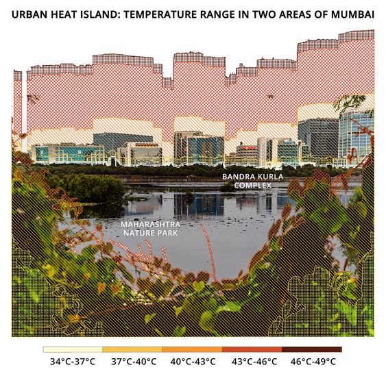
Urban Heat Islands in a city can have different temperatures not only between the city and its surrounding areas, but within a city itself.

We gathered data from different neighbourhoods in Mumbai and Delhi, using Landsat 8 ST_B10 band and processed the data using Google Earth Engine. Alisha Vasudev/Mongabay has illustrated the range of temperatures in a given neighbourhood for recorded minimum and maximum surface temperatures at a given time, on a regular summer day in 2022.

The minimum and maximum surface temperatures of two Mumbai neighbourhoods, with different physical characteristics, were recorded at 11 am on April 15, 2021. This illustration shows which temperature range (in intervals of three degrees) is recorded in what percentage of the area in each of these neighbourhoods. Illustration by Alisha Vasudev/Mongabay.

Maximum Land Surface Temperature in India, 01 March - 31 May 2022

According to experts, India's heat action plans need to incorporate long-term measures including efforts to decrease indoor temperatures, be regularly monitored and updated, and be more proactive to decrease heat stress.

(Note: This is the fifth blog in the series, on our collaboration with Mongabay-India. Read the previous blog here, and the first in the series, here.)

Tracking Air Pollution


As winter commences in North India, the presence of PM2.5 makes it to the headlines in New Delhi. Particulate matter, (PM) in particular PM2.5 is the classification of fine inhalable particles, with diameters that are generally 2.5 micrometers and smaller. In comparison, human hair ranges from 50-70 micrometers which makes the fine particulate matter, PM2.5 in this case, 30 times smaller in size and hence inhalable. Health and visibility problems are caused in New Delhi post-monsoon due to the burning of paddy in the states of Punjab and Haryana, India. The paddy is harvested during the month of October and wheat is sown swiftly after. The management of paddy stubble in the time interval between harvest and sowing of wheat is crucial. 

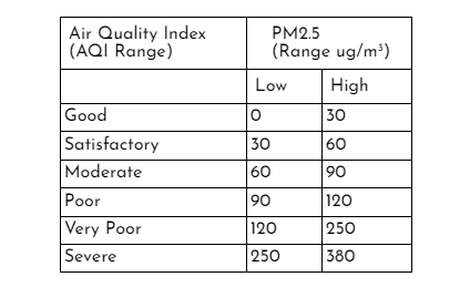
The wind carries the residue of the burnt paddy (PM2.5) through to Delhi and the city consequently experiences ‘very poor’ to ‘severe’ air quality levels during the winter months. The acceptable limits based on the health impacts of PM2.5 are shown in Table 1.

Table 1: AQI Range of PM2.5

Table 1: AQI Range of PM2.5

We created spatial data visualisations highlighting the deteriorating air quality in Northern India due to the burning of paddy, to accompany an article in Mongabay-India. The Mongabay article gives an insight into what stops the paddy from turning into biofuel - covering the technical, financial and official handicaps. A part of the article explored the mapping of paddy burning locations from September to November, 2021 and the PM2.5 mapping from October to November, 2021. 

In this post, we share how satellite imagery of PM2.5 was processed and animated to display the severity of air pollution by using ECMWF’s CAMS Global Near Real Time data from Google Earth Engine (GEE) data catalogue. The time period of 1st October, 2021 to 30th November, 2021 was chosen to highlight the PM2.5 levels post harvest-season.

First, a Daily-Means algorithm is prepared to aggregate data so that one day in the said time-interval has one output image of PM2.5. In this case, mean is used to aggregate the daily data into one image. At the end of this step, we have an Image Collection of 61 daily images with PM2.5 for each day (Figure 1).

Figure 1: Daily Mean algorithm

This image collection is then clipped to the desired extent (using the in-built clip function of GEE). The Daily-Means image collection data can also be added to the GEE map display panel using the Map.addLayer function. In this case, the mean function was used to display the Image Collection output in the Layers Panel.

Figure 2: Image Collection display

The next step is to create the animated dataset using the image collection. In this case, a scale bar, title and outline of state boundaries (Punjab and Haryana, India) of the image are displayed in the final animation. The scale bar is positioned by specifying its coordinates. Its maxima and minima labels, that is the PM2.5 levels as well as its style: font-size, colour, etc, can also be customised. At the same time, the title and its style are chosen and rendered. The outline of the required area which is captured in the animation is added next. The scale bar, title and outline are then blended into the Daily Means map using the in-built blend function of GEE. Next, the overall coverage of the extent of the animation is specified with coordinates-this extent subsumes the scale, title, outline and other add-ons of the animation around the actual map of interest. The visualization parameters of the animated dataset are then specified and printed to the console (Figure 3). The styling of animation felt a bit tedious as the arrangement of add-ons (scale bar, tittle, etc) is relative to the latitude longitude coordinates of the map of interest. Although it makes the dataset visualisation accurate, moving the add-ons needs careful calculations.

Figure 3: Animation display

The following animation (Figure 4) was used to visualize the impact of burning paddy in Punjab, Haryana and New Delhi, india.

Figure 4: Animated PM2.5

Although the intensity of pollution seems linked to the increase in the number of burning locations, there were some glitches in interpreting the scale of the data provided. Scale of the data varies from 0 to 0.1 ug/m3 according to the dataset provider’s unit during the said time-period for the concerned area shown in Figure 4. The actual scenario of PM2.5 levels in the air is evidently greater than the permissible limits. While we share the process of animating the PM2.5 data, we are trying to better understand its scale as well. 

It took around two days to piece the code together. While this was sufficient, a host of other options are available at ‘users/gena/packages’ (Figure 5) in the Script Manager section of the GEE code editor interface which can be harnessed to load more information on the animated dataframes based on the requirement. I hope to further explore this package for better application and visualization.

Figure 5: Package for animation

The animated dataset here shows us the change in air quality. While this gives us a peep into reality, we hope to see all paddy turn into biofuel soon. If you have any questions or comments, get in touch with us at contact@techforwildlife.com.