
Over the last few days of 2020, I’ve been learning how to use Google Earth Engine (GEE). Guided by the tutorials provided by NASA’s Applied Remote Sensing Training Program (NASA-ARSET) on mangrove mapping in support of the UN’s Sustainable Development Goals, I’ve been attempting to use GEE to map mangroves in my area of interest - St. Inez Creek, Panjim, Goa. While I’ve conducted similar exercises using traditional desktop-based GIS software before, I’m both a new GEE user and new to JavaScript coding.
The first part of the exercise consisted of loading satellite data into GEE. Compared to finding relevant satellite images for an area, downloading them onto my device and loading them into desktop GIS software, the process in GEE was much faster and easier for me to conduct. The next step consisted of drawing polygons for the area of interest. This was similar to creating vector polygons in GIS software, and the intuitive interface made it straightforward to begin and pause polygon creation, as well as to edit existing polygons. Exporting these into kmls though took a lot of time to process, at least on my device.
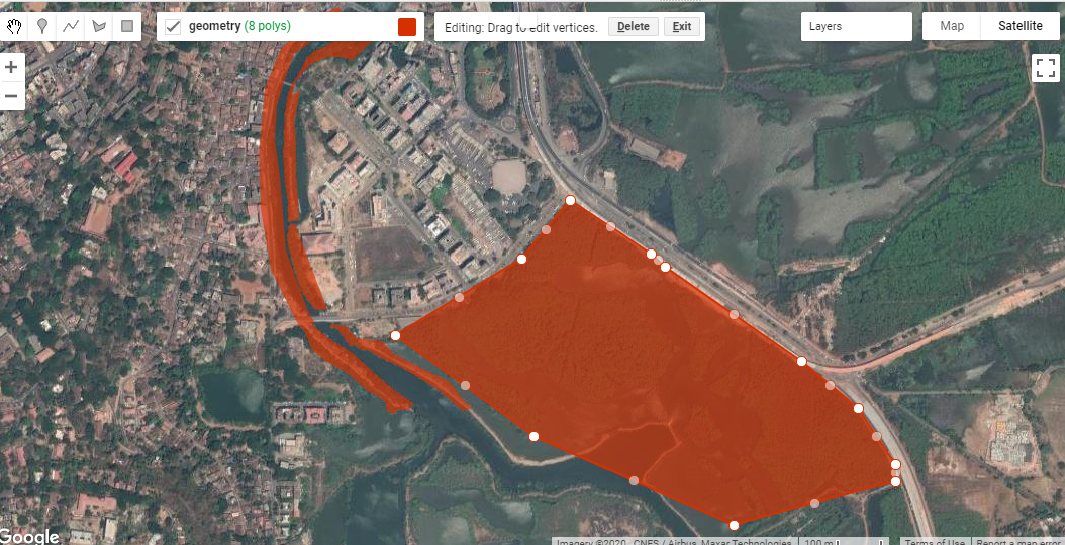
Fig. 1: Creating polygons for my area of interest in St. Inez, Panjim, Goa.
I was looking at decadal change in the area between the years 2009 and 2019. The script made available with the NASA-ARSET tutorials creates mosaics by first looking for images from a year before and after the designated year of interest, and by then masking clouds. I was only able to do this in GEE because the JavaScript code for this was already written out and available to me, but I found this part of the processing extremely powerful, especially compared to doing it on my own device. I then applied vegetation indices onto these mosaics, creating false colour composites that could be used to identify vegetation in my area of interest between 2009 and 2019.
The fourth major step consisted of creating a Random Forest Model for both the years. For this, I used the false colour composites of the mosaics, derived using the vegetation indices in the previous step, to create categories of mangrove and non-mangrove areas, and marked examples of each using visual identification. Because I had clear instructions available for this part (via the tutorials), this was a straightforward procedure. The mangrove and non-mangrove categories had a property of land cover with a binary value of either 0 or 1. I imagine that such a table would look similar to an attribute table, although I was unable to export it to a shapefile to check.

Fig. 2: Visual classification of mangroves for training data.
After training the data, I ran the Random Forest Model JavaScript code in GEE . On viewing the area classified as mangrove extent for the year 2009, it looked like a lot of what should have been mangroves had been marked otherwise. An internal test indicated an accuracy of 0.7; ideally, the closer this value is to 1, the more accurate the model. To improve the accuracy, I added more training data and then ran the model again. This time the accuracy was much higher and the area under mangrove extent appeared to be depicted more accurately.

Fig. 3: Mangrove extent in 2009, as determined by the Random Forest Model implemented in GEE.
The outputs of mangroves appear to be fair estimates of actual ground-level mangrove extent, but would need to be verified using additional data and alternative methods to obtain an objective assessment as to its accuracy. The model estimated that within my area of interest, mangrove extent in 2009 was 29.82 ha while in 2019 it was 28.74 ha. I tried to run an external accuracy test using the Class Accuracy plugin in QGIS, which reviews random stratified data from the random forest to check whether it has been classified correctly. However, I kept receiving errors while trying to produce an error matrix for the classification using the plug in so that’s something I still have to work on.

Fig. 4: A screenshot of the GEE console displaying the error matrix for the model
The second part of the exercise was to create a GEE application which would allow a user to interact with the data directly, visualising the change in mangrove cover in the Area of Interest within the determined time period. I had some setbacks with this section, which I’ll describe in detail.
I began by exporting the mangrove extents calculated previously into raster images to be used for classification within the GEE app I was creating. The images were then imported into the script, and used as the basis of the visualisation. When I ran the JavaScript code I’d modified, the app appeared but the links from the buttons appeared to be broken; despite picking a year, no layer appeared on the map. The process of looking for errors felt similar to that I’ve encountered in RStudio, where the line of code with the error was highlighted, and some indication of the error’s nature was provided as well. This definitely made reading and editing the code easier for a GEE/JavaScript novice like me. Having fixed this, I ran the code again and this time the layers appeared; however, instead of displaying mangrove extents, fixed-area blocks appeared within the area of interest for both years (Fig 5).

Fig. 5: The rectangular block error in my GEE app; this should depict mangrove extent, but doesn’t..
Despite several scans of the script to find errors and understand why this happened, I’m still quite confused. The issue appears to be in the images that I’m exporting. Even though the image being exported is the area classified as mangrove extent, which appears correctly on the map, when exported as an image, it’s saved as these blocks in the area. I’m still trying to figure out exactly what’s going wrong here.
Overall, this was a fun exercise to learn and work through, and a good introduction to Google Earth Engine’s capabilities for conservation geography. The entire process of actually processing the images, applying indices and using a Random Forest Model was faster in GEE than it would have been on my desktop, thanks to the code available to me via the NASA-ARSET tutorials. With regard to setting up the GEE apps, I still have a lot of trouble-shooting to do over the next few weeks. If you have any leads, please do comment on this post, or send me an email via our contact form.


