
As winter commences in North India, the presence of PM2.5 makes it to the headlines in New Delhi. Particulate matter, (PM) in particular PM2.5 is the classification of fine inhalable particles, with diameters that are generally 2.5 micrometers and smaller. In comparison, human hair ranges from 50-70 micrometers which makes the fine particulate matter, PM2.5 in this case, 30 times smaller in size and hence inhalable. Health and visibility problems are caused in New Delhi post-monsoon due to the burning of paddy in the states of Punjab and Haryana, India. The paddy is harvested during the month of October and wheat is sown swiftly after. The management of paddy stubble in the time interval between harvest and sowing of wheat is crucial.
The wind carries the residue of the burnt paddy (PM2.5) through to Delhi and the city consequently experiences ‘very poor’ to ‘severe’ air quality levels during the winter months. The acceptable limits based on the health impacts of PM2.5 are shown in Table 1.
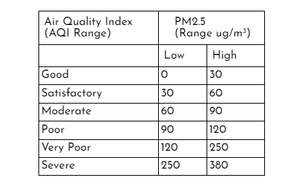
Table 1: AQI Range of PM2.5
We created spatial data visualisations highlighting the deteriorating air quality in Northern India due to the burning of paddy, to accompany an article in Mongabay-India. The Mongabay article gives an insight into what stops the paddy from turning into biofuel - covering the technical, financial and official handicaps. A part of the article explored the mapping of paddy burning locations from September to November, 2021 and the PM2.5 mapping from October to November, 2021.
In this post, we share how satellite imagery of PM2.5 was processed and animated to display the severity of air pollution by using ECMWF’s CAMS Global Near Real Time data from Google Earth Engine (GEE) data catalogue. The time period of 1st October, 2021 to 30th November, 2021 was chosen to highlight the PM2.5 levels post harvest-season.
First, a Daily-Means algorithm is prepared to aggregate data so that one day in the said time-interval has one output image of PM2.5. In this case, mean is used to aggregate the daily data into one image. At the end of this step, we have an Image Collection of 61 daily images with PM2.5 for each day (Figure 1).

Figure 1: Daily Mean algorithm
This image collection is then clipped to the desired extent (using the in-built clip function of GEE). The Daily-Means image collection data can also be added to the GEE map display panel using the Map.addLayer function. In this case, the mean function was used to display the Image Collection output in the Layers Panel.

Figure 2: Image Collection display
The next step is to create the animated dataset using the image collection. In this case, a scale bar, title and outline of state boundaries (Punjab and Haryana, India) of the image are displayed in the final animation. The scale bar is positioned by specifying its coordinates. Its maxima and minima labels, that is the PM2.5 levels as well as its style: font-size, colour, etc, can also be customised. At the same time, the title and its style are chosen and rendered. The outline of the required area which is captured in the animation is added next. The scale bar, title and outline are then blended into the Daily Means map using the in-built blend function of GEE. Next, the overall coverage of the extent of the animation is specified with coordinates-this extent subsumes the scale, title, outline and other add-ons of the animation around the actual map of interest. The visualization parameters of the animated dataset are then specified and printed to the console (Figure 3). The styling of animation felt a bit tedious as the arrangement of add-ons (scale bar, tittle, etc) is relative to the latitude longitude coordinates of the map of interest. Although it makes the dataset visualisation accurate, moving the add-ons needs careful calculations.

Figure 3: Animation display
The following animation (Figure 4) was used to visualize the impact of burning paddy in Punjab, Haryana and New Delhi, india.

Figure 4: Animated PM2.5
Although the intensity of pollution seems linked to the increase in the number of burning locations, there were some glitches in interpreting the scale of the data provided. Scale of the data varies from 0 to 0.1 ug/m3 according to the dataset provider’s unit during the said time-period for the concerned area shown in Figure 4. The actual scenario of PM2.5 levels in the air is evidently greater than the permissible limits. While we share the process of animating the PM2.5 data, we are trying to better understand its scale as well.
It took around two days to piece the code together. While this was sufficient, a host of other options are available at ‘users/gena/packages’ (Figure 5) in the Script Manager section of the GEE code editor interface which can be harnessed to load more information on the animated dataframes based on the requirement. I hope to further explore this package for better application and visualization.

Figure 5: Package for animation
The animated dataset here shows us the change in air quality. While this gives us a peep into reality, we hope to see all paddy turn into biofuel soon. If you have any questions or comments, get in touch with us at contact@techforwildlife.com.
